
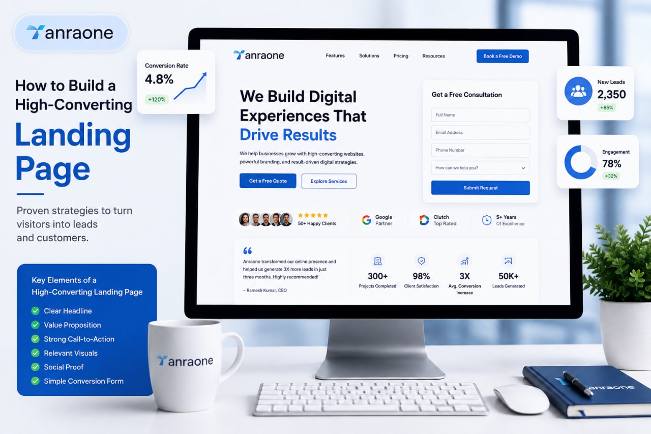
Structure, copy, and trust signals. The anatomy of a page that actually makes money.
A high-converting landing page is designed to guide visitors toward one specific action, whether that means submitting a form, booking a consultation, requesting a quote, signing up for a service, or making a purchase. A successful page does more than look professional. It communicates the right message, builds trust, removes distractions, and makes it easy for visitors to take action.
Understanding the high-converting landing page anatomy helps businesses create pages where every section has a clear purpose. From the headline and value proposition to the call-to-action, visuals, social proof, and form, each element contributes to the overall conversion experience.
What Makes a Landing Page High-Converting?
A high-converting landing page brings together several important elements to create a focused experience for visitors. The page should communicate its message clearly, show the value of the offer, use a strong call-to-action, provide relevant information, and establish trust.
The design should also keep visitors focused on the main conversion goal. When every section supports the same objective, visitors can understand the offer quickly and make decisions with less hesitation.
Define One Clear Conversion Goal
Every landing page should have one primary conversion goal. This could be booking a consultation, requesting a quote, signing up for a service, downloading a resource, or completing a purchase.
Having one clear goal prevents the page from becoming confusing. Instead of asking visitors to choose between several unrelated actions, guide them toward the action that matters most.
The headline, content, visuals, and call-to-action should all support this goal. A focused landing page makes it easier for visitors to understand what they should do next.
Understand Your Target Audience
Before creating a landing page, understand who you are trying to reach. Your audience's needs, problems, expectations, and intent should influence the way you present the offer.
Think about the questions your potential customers may have. What problem are they trying to solve? What information do they need before taking action? What concerns might stop them from converting?
When the content reflects the audience's needs, visitors are more likely to recognize the value of the offer and continue through the page.
Create a Strong Landing Page Headline
The headline is one of the first things visitors see. It should immediately communicate what the landing page offers and why it matters to the visitor.
A strong headline is clear, specific, and focused on the main benefit. Avoid complicated wording or headlines that make visitors guess what the page is about.
For example, instead of using a generic headline such as “Our Digital Services,” a more focused headline could explain the actual benefit of the service.
The headline should give visitors a reason to continue reading.
Write a Clear Value Proposition
A value proposition explains what you offer, who it is for, and why visitors should consider it. It should make the main benefit easy to understand.
A clear value proposition connects the visitor's need with your solution. It can explain how your product or service solves a particular problem or helps the customer achieve a desired result.
Keep the message simple and relevant. Visitors should be able to understand the value without reading several paragraphs.
Write Content That Focuses on Benefits
Landing page content should focus on what visitors can gain from the offer. Instead of listing features without context, explain how those features benefit the customer.
For example, if a service provides faster website performance, explain how that improvement can create a better experience for visitors. Connecting features to real benefits makes the content more meaningful.
Use short paragraphs, clear headings, and easy-to-scan information. Avoid adding content simply to make the page longer.
Add a Strong Call-to-Action
A call-to-action tells visitors what to do next. Examples include “Get a Free Quote,” “Book a Consultation,” “Start Now,” and “Request a Demo.”
The CTA should clearly communicate the action and be easy to find. Use wording that matches the conversion goal of the page.
CTA buttons can appear at important points throughout the page, particularly after visitors have received enough information to make a decision. However, each CTA should lead to the same primary conversion action.
Use Visuals That Support the Message
Visual elements can help visitors understand the offer quickly. Relevant images, videos, illustrations, product demonstrations, and graphics can support the information presented on the page.
The visuals should have a purpose. They should reinforce the message rather than distract visitors from the main conversion goal.
Choose visuals that are relevant to the product, service, or audience. Avoid using decorative images that do not add meaningful value to the page.
Build Trust with Social Proof
Visitors may hesitate to take action when they are unfamiliar with a business or offer. Social proof can help reduce that hesitation.
Testimonials, customer reviews, client logos, case studies, ratings, and relevant results can demonstrate that other customers have had positive experiences.
Place trust elements where they naturally support the decision-making process. For example, testimonials can appear near a CTA or offer to provide additional confidence before visitors take action.
Design a Simple and Focused Layout
A landing page should make it easy for visitors to understand the information and move toward the conversion goal.
Use a clear visual hierarchy so important elements such as the headline, value proposition, and CTA receive appropriate attention. Whitespace can separate sections and prevent the page from feeling crowded.
Readable typography, consistent spacing, clear sections, and a focused layout can create a more comfortable experience for visitors.
Make the Landing Page Easy to Use
Good landing page design is not only about appearance. Visitors should be able to understand and interact with the page without unnecessary effort.
Use clear navigation, straightforward information, understandable buttons, and intuitive interactions. Avoid making visitors search for important information or work through complicated steps.
The easier the page is to understand and use, the fewer obstacles visitors face when trying to complete the desired action.
Optimize the Landing Page for Mobile
Many visitors access landing pages through smartphones and tablets. A page that works well on desktop but is difficult to use on mobile can lose potential conversions.
Use responsive layouts that adapt to different screen sizes. Text should remain readable, buttons should be easy to tap, and images should display correctly.
Forms should also be easy to complete on smaller screens. Visitors should not need to zoom, scroll excessively, or struggle with small interactive elements.
Create a Conversion-Friendly Form
If the landing page uses a form, keep it simple and relevant to the conversion goal.
Ask only for information that is necessary. A form with too many fields can make the process feel difficult and may discourage visitors from completing it.
Use clear labels and instructions so visitors know exactly what information they need to provide. The submit button should also communicate what happens next.
Reduce Distractions and Friction
Every unnecessary element on a landing page can create another opportunity for visitors to lose focus.
Avoid excessive links, unrelated content, complicated forms, unnecessary pop-ups, and unclear instructions. Keep the page centered around the main offer and conversion goal.
The visitor should always understand what the page is offering, why it is valuable, and what action they should take next.
Test and Improve Your Landing Page
A landing page should not be treated as a finished product. Testing can help identify which elements are most effective at encouraging conversions.
Different headlines, CTA wording, layouts, images, content, and forms can be tested to compare their performance.
Instead of making changes based only on assumptions, use actual visitor behavior and conversion results to guide improvements. Continuous testing can help a landing page become more effective over time.
Common Landing Page Mistakes to Avoid
Several common mistakes can reduce landing page conversions.
An unclear headline can make visitors unsure about the offer. A weak CTA may fail to encourage action. Too much information can make the page difficult to scan, while poor design can distract visitors from the main message.
Other problems include a lack of trust signals, complicated forms, unclear benefits, excessive links, and poor mobile usability.
Avoiding these issues helps create a cleaner and more focused conversion experience.
High-Converting Landing Page Checklist
A high-converting landing page should include:
- One clear conversion goal
- A strong and relevant headline
- A clear value proposition
- Benefit-focused content
- A strong call-to-action
- Relevant and useful visuals
- Trust signals such as testimonials or reviews
- A simple and focused layout
- Easy-to-use page elements
- Mobile-friendly design
- A simple conversion form
- Minimal distractions
- Regular testing and improvement
Conclusion
Building a high-converting landing page requires more than creating an attractive design. Every element should work together to guide visitors toward a clear action.
A strong headline captures attention, the value proposition communicates the offer, useful content explains the benefits, visuals support the message, social proof builds trust, and a clear CTA encourages action. A simple layout, mobile-friendly experience, and easy form further reduce friction.
By understanding the high-converting landing page anatomy and continuously improving each element, businesses can create landing pages that provide a better user experience while increasing the opportunity to turn visitors into leads or customers.